In 2021, digital sales amounted to approximately $4.9 trillion worldwide. Predictions see this number growing by a whopping 50% over the next four years, bringing the total up to $7.5 trillion. But despite this uptick in the popularity of shopping online, conversion rates for e-commerce businesses have stayed the same.
The average e-commerce CR tends to fall between 2% and 5%, depending on the season, location, and niche of the online retail industry targeted by e-commerce sites.

Here’s the thing. Converting 2% to 5% of all website visitors into customers may sound like a satisfactory result of all your marketing efforts, but it’s not really enough to take your business (or your finances) to the next level.
Because in truth, it means that 95% of all your website visitors walk away without becoming customers of your business. That’s a huge loss!
What can you do to maximize conversions on your website? Well, one solution is to invest in bottom-funnel optimization. And the best way to do that is to focus your efforts on product pages where you hold the highest chance of converting visitors into buyers.
If you’re ready to get started, the following product page design tips will help you optimize your conversion rates.
Post Contents
1. Buy Credibility with Trust Badges
One of the biggest obstacles to consumers converting is a lack of trust in content.
Since 2019, the world has been going through a so-called trust crisis. Fewer and fewer people count on their governments, media, and NGOs to do what’s right. The only organization that seems to have gone unscathed is business.
But not being distrusted isn’t exactly enough to convince consumers to become loyal customers of your brand. You have to do everything in your power to make them see that what you offer is for real. Moreover, you need to help them feel safe when buying from your brand, showing that they won’t regret depending on your business to deliver on its promises.
What’s the best way to do this? Well, according to the latest research on trust from Edelman, it’s by using high-quality, relevant information to build confidence. In other words, it’s finding ways to successfully address buyers’ concerns and communicate the way you intend to keep the promises from your value proposition.
The easiest way to do this on product pages is to use trust badges. As small design elements, these graphics successfully draw web visitors’ attention, convey information, and deliver helpful facts that can convince potential customers to convert.
There are several types of trust badges that can help you maximize product page conversions.
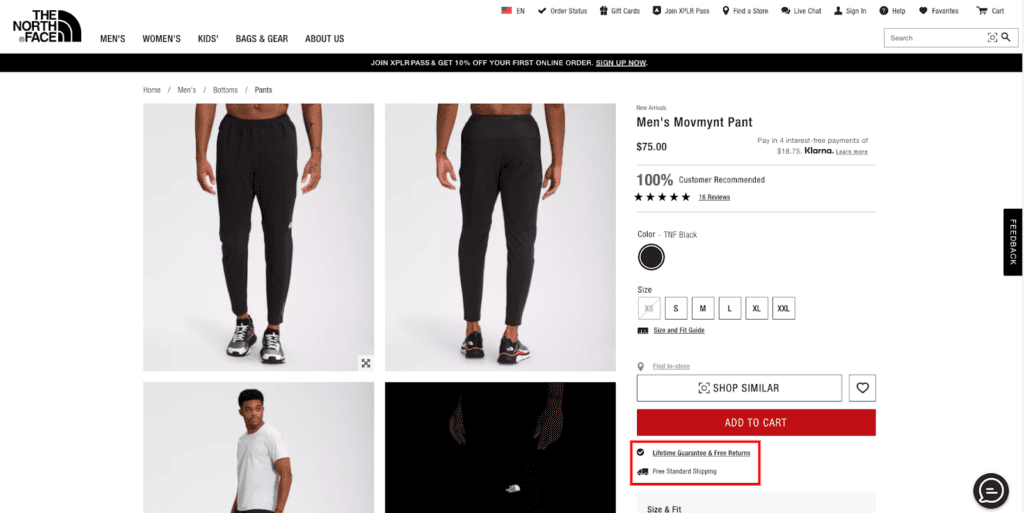
Returns Policies & Money-back Guarantees
People want to think they’re getting value when spending their hard-earned cash. But, in reality, their expectations often go unmet. You need to find a way to decrease their sense of risk when shopping with your brand – and help them bite the bullet on purchasing a product.
To do this, you can use a trust badge that points out you offer free returns or a money-back guarantee, like the one used by The North Face.

Free Shipping Conditions
Buyers tend to choose stores that offer free shipping. However, most businesses have conditions on how much buyers have to spend to qualify for free shipping.
To avoid high cart abandonment rates due to unexpected costs, consider adding a trust badge to your product page that communicates free shipping conditions. For inspiration, check out the one used by Barner.


Delivery Promises
With Amazon leading the e-commerce game, consumers have gotten used to receiving their ordered products within 48 hours or less. So, if your plan is to attract customers with next-day shipping, make sure web visitors know to expect it.
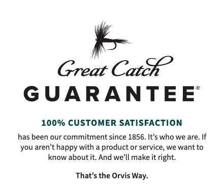
Quality Assurances
If what differentiates your products is their superior quality, ensure that your potential buyers know what they’re getting. A quality assurance trust badge is an excellent way to give buyers peace of mind. See how Orvis does it with its Great Catch Guarantee below.

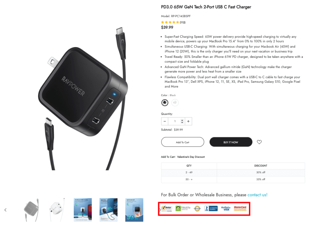
Transactional Security
Data shows that 76% of buyers want safe payments more than convenience when shopping online. So, to convince web visitors to become customers of your brand, it’s not a bad idea to show that you’re serious about keeping their credit card information safe.
Badges like the ones used by RAVpower are an excellent way to instill trust and maximize conversions as a result of it.

2. Use a Compelling CTA
Another excellent strategy to boost product page conversions through design tweaks is to look at your calls to action, and find ways to make them more compelling.
When it comes to science-backed strategies for making your CTAs shine, three methods stand out in a sea of advice.
Positioning
To help your calls to action become compelling, the first thing you need to look at is positioning.
Eye-tracking studies from the past two decades have uncovered significant discoveries regarding how people look at websites. By applying that knowledge to the way you design product pages, you can determine the best spots to place your CTA buttons.
In general, there are a few product page layout rules you should follow to secure the best results.
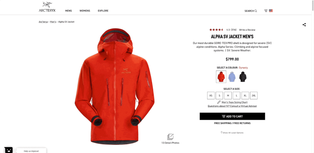
- Place CTA Buttons Above the Fold: People spend 57% of their page-viewing time above the fold. To maximize conversions, make sure that your CTA buttons are visible in the top section of your product page – the content a customer sees when the page first opens, without scrolling.
- Follow the Z-pattern: When looking at online content, readers tend to gravitate towards a few page-viewing patterns. You may already be familiar with the F-pattern or the Gutenberg diagram and feel like those are great layout options to ensure your CTAs are seen.
However, remember that these are best applied to text-heavy pages like blog posts. On product pages, the Z-pattern offers more benefits than its alternatives. It gently leads page visitors from the top left corner towards the bottom right of the page, where your CTA is likely to receive the most attention. - Make CTAs Scroll-Friendly: To generate high conversion rates, product pages have to provide potential buyers with sufficient information to convince them to convert. That means that your web visitors will, almost certainly, have to scroll down to find out everything they need to make the right purchasing decision.
To ensure that they still convert, don’t forget to optimize your CTAs so that they’re visible, even once readers have moved on from the top of the page.
An example of a product page that follows all three of these rules comes from Arc’teryx, which shows how effective a few layout changes can be in ensuring the visibility of a CTA button.

Colour
The second thing that will help your CTAs stand out is the colour you choose for your buttons.
To get the best possible results, avoid generalized design advice. (Most designers and marketers are familiar with the piece of advice that using red vs. green CTA buttons yields higher conversions). Instead, make your design choices based on your brand’s visual identity, following rules that pertain to colour, contrast, and button size.
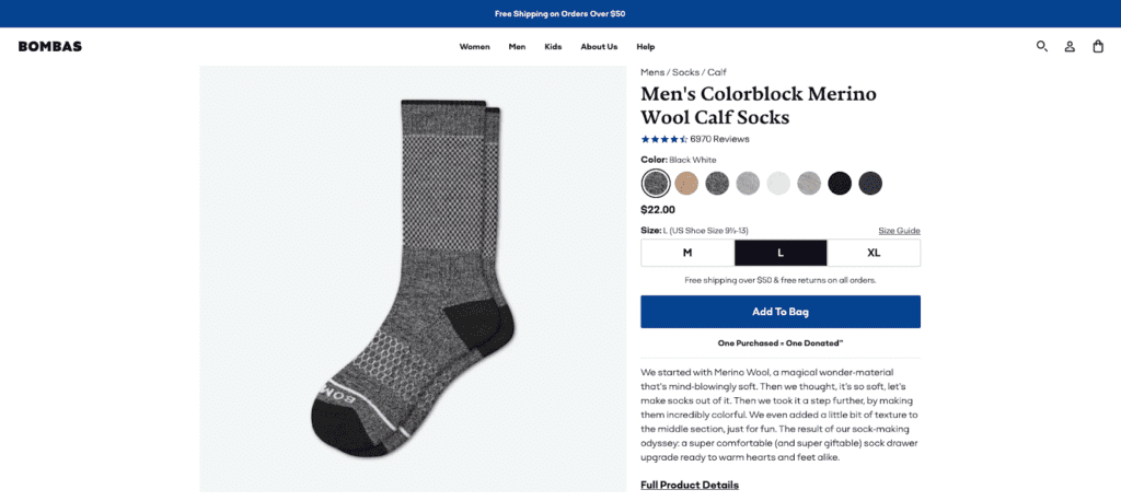
As proof that CTAs don’t have to be red or green to convert, check out the Bombas product page below. It features a blue CTA on a pure white background. The colour is an excellent choice, and not just because it provides sufficient contrast. It also matches the visual branding of other key conversion details, including the free shipping banner alert at the top and the star rating below the product name.

Copy
As you look for ways to optimize your product page CTA buttons to increase conversions, don’t forget the persuasive power of words. After all, a blank button with no call to action won’t amount to much, will it?
To nudge your web visitors towards making a purchase, explore ways to use copy to convince them to buy from your brand.
You can achieve a great deal by utilizing action words. You can see even better results by keeping your UX copy short and to the point. And you can minimize the risk buyers associate with the purchase by employing microcopy to build trust.
As an illustration of how you can use copy to make your CTAs more attractive, check out the example below from SaaS brand ProofHub.
The page features a CTA that invites web visitors to “Get started for free,” – with the “get started” part being an action-oriented piece of copy. The button also highlights that the trial is free – another big plus in convincing potential customers to convert. And, as the cherry on top, the microcopy below the button states that converting requires no installation, no credit card, and no chaos.
Together, these three CTA copy elements make it super-compelling for web visitors to convert.


3. Your Product Gallery Is Critical
Visuals play a big part in convincing consumers to convert on product pages. According to Google’s research, 53% of online shoppers are influenced by images to purchase. Moreover, 50% of consumers make purchasing decisions based on visuals.
And, sure, in 2022, adding awe-inspiring product photography to your product pages shouldn’t be too difficult. So, if you want to maximize conversions on your site, look for ways to take your product photography to the next level with the following tips.
Size Matters
A scientific research study from 2014 discovered that certain technical features made product photography more powerful in convincing web visitors to buy. According to the study results, consumers like to see product images that:
- Have a big key object
- Are well-ordered instead of chaotic
- Feature a warm colour palette
- Have high contrast and depth of field
- Feature social presences
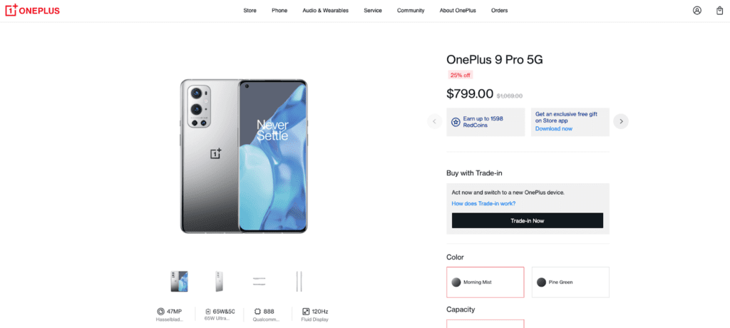
The OnePlus website nails most of these conditions, particularly by showing off products in their full, life-sized glory.

Context is Key
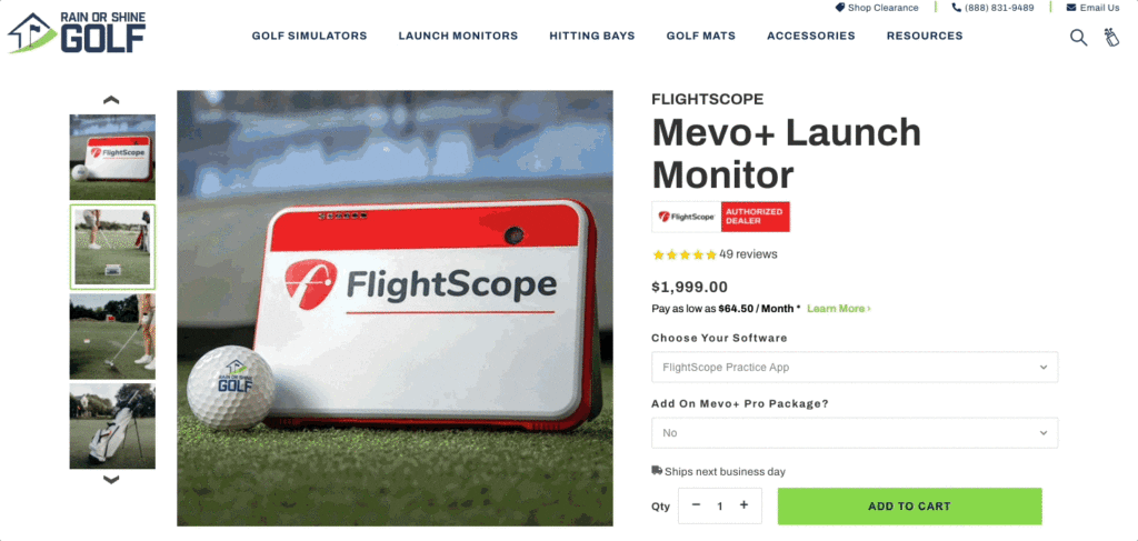
Sixty-four percent of women say that product photos showing items being used positively impacts their shopping decisions when they browse items on mobile. Don’t hesitate to include some context in your product photography.
See how well Rain or Shine Golf does it, showing its product from every imaginable angle and in several different use cases.

Negative Space Helps Products Stand Out
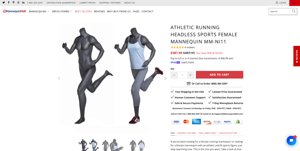
Using white background product photography is an excellent way to show off your products, as negative space makes high-value information (like photos) stand out on content-heavy pages.
The Mannequin Mall example below is an excellent illustration of that.

Use Video
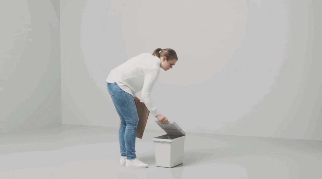
Videos are definitely a more exciting format than old-school product photography, so it’s no surprise that video tends to convert 20-30% better than images.
Big brands like Ikea make full use of video, not only to make their products more exciting but also to ensure potential buyers know what they’ll be getting once the parcel arrives at their doorstep.

4. Go the Extra Mile with Social Proof
Displaying product ratings and reviews significantly boosts conversion rates simply because consumers look to the opinions and experiences of others when making buying decisions in categories outside their expertise.
But the truth is, these two types of social proof aren’t enough to differentiate your brand from your competition. Nor will they convince consumers to move through your sales funnel more quickly, as they don’t hold enough persuasive power.
To see higher conversion rates on your product pages and make the most of the positive experiences of your existing customers, look for ways to take your social proof to the next level. The following two options are easy to implement yet promise high returns without a huge investment.
User-generated Content
One of the best ways to harness the power of social proof is to combine it with user-generated content (UGC) submitted by your satisfied customers.
According to TINT’s State of User-Generated Content Report for 2022, buyers really appreciate seeing UGC. In fact:
- 72% of people find UGC more credible than branded promotion
- 64% say they would be more likely to shop with a brand that re-shares content submitted by customers
- 64% have tagged a brand or used a hashtag on social media before
And the great thing about implementing UGC on your product pages is that it’s super easy.
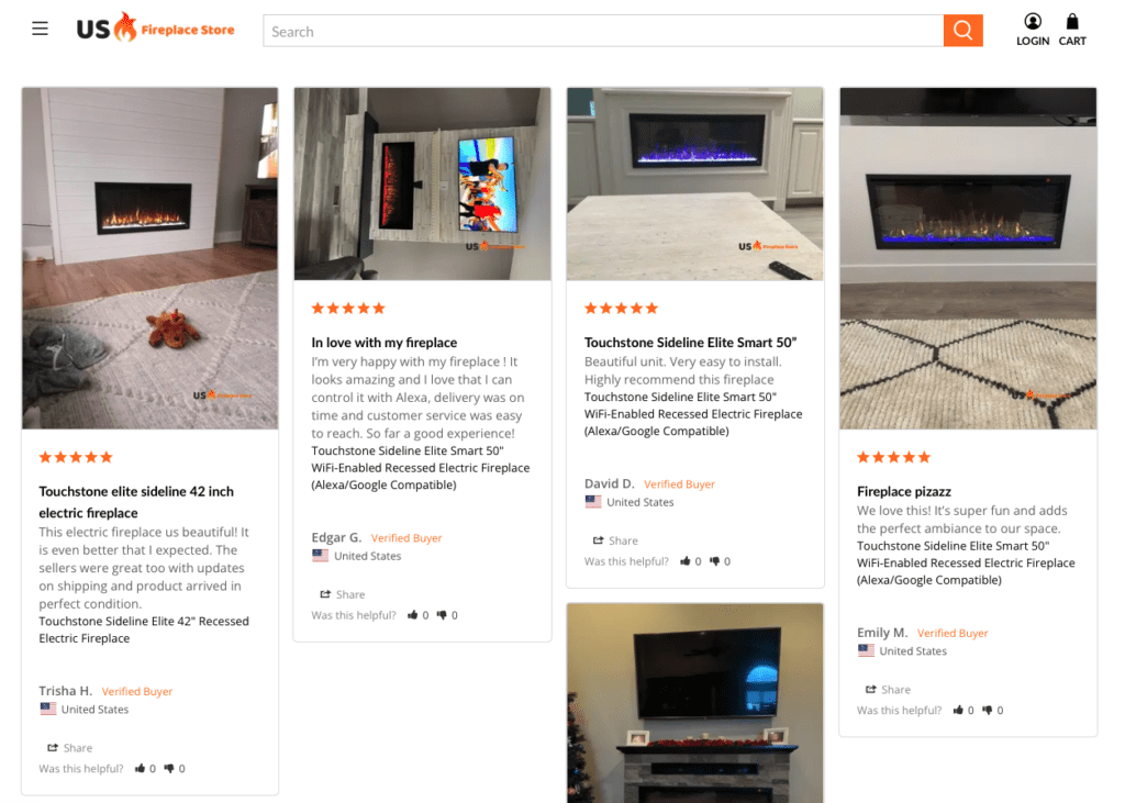
For example, you can do something akin to US Fireplace Store and allow your buyers to add images or videos to the reviews they leave on your site. This strategy will certainly add a dose of credibility to the reviews on your site. On top of that, it will also help potential buyers visualize the products in their own lives.
That will help evoke FOMO and convert them faster than relying on traditional ratings or testimonials.

Show Real-time Sale Notifications
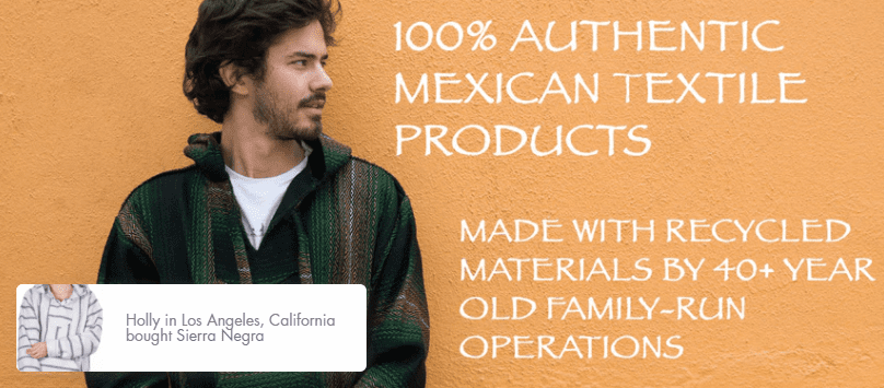
But what if you just launched and you don’t have enough social proof on your product pages to support your brand’s authority and trustworthiness? Well, you might want to give real-time sale notifications a try.
This simple solution is a great way to make your store seem busy and thriving. Plus, it works to show website visitors that real-life people are buying real-life products at the very online store they’re browsing right now.
Orizaba Original uses this strategy. Knowing that it operates in a niche market and is not likely to generate a high volume of reviews, the brand uses real-time sale notifications. This way, it’s helping first-time web visitors see that they’re browsing a genuine store. And, with consumers in the lower stages of the sales funnel, it’s generating the same sense of FOMO that UGC brings to traditional testimonials.

5. Nudge Shoppers with Scarcity and Urgency
There are two more fears you can use on your product pages to boost conversions: scarcity and urgency.
Do you remember the toilet paper shortage of 2020? If you do, you already know that consumers buy and hoard things that appear to be scarce, even if they don’t actually have a use for them. And they do the same when they encounter a sense of urgency.
If you’re willing to play minor psychological tricks, you could use the two to increase conversion on your product pages. And all you need are a couple of well-placed banners, pop-ups, or badges.
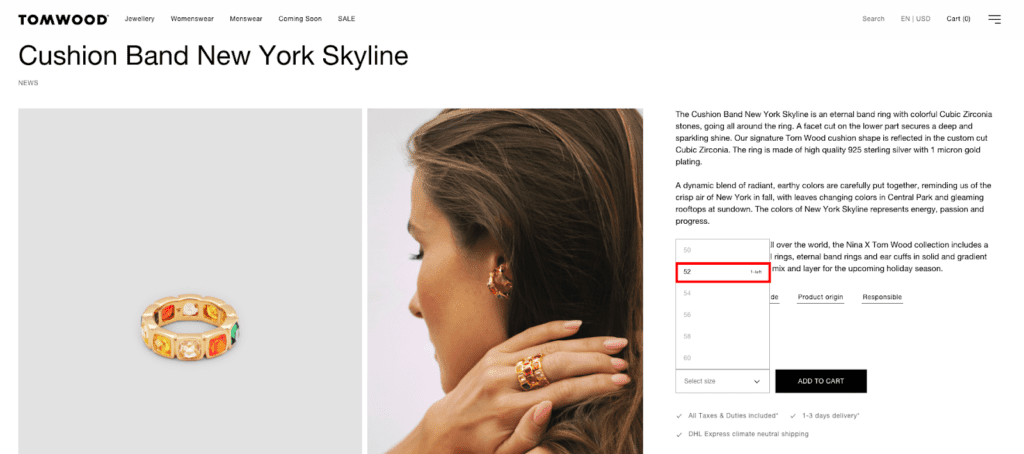
The Tom Wood website does this flawlessly. It shows the number of items left in stock for each size, urging shoppers to buy as quickly as possible. Because if they don’t, they’re most likely to miss out.

6. Simplify the Quote Process
Finally, as you look for ways to boost conversions on your product pages, you have to look towards one of the main conversion-driving trends for 2022: personalization.
According to McKinsey’s report from November 2021:
- 71% of buyers expect companies to deliver personalized interactions.
- 76% feel let down when this doesn’t happen.
- And, perhaps most importantly, brands that utilize personalization grow 40% faster than those lagging behind.
But the thing about personalization on product pages is that it’s challenging to get right. This is why so few online retailers offer product customization options on their websites.
So, what do you do if you decide to bite the bullet and invest in a system that will allow your audience to purchase precisely what they want from your store? Well, make sure that the process is easy, fun, and genuinely helpful in making the shopping process more enjoyable.
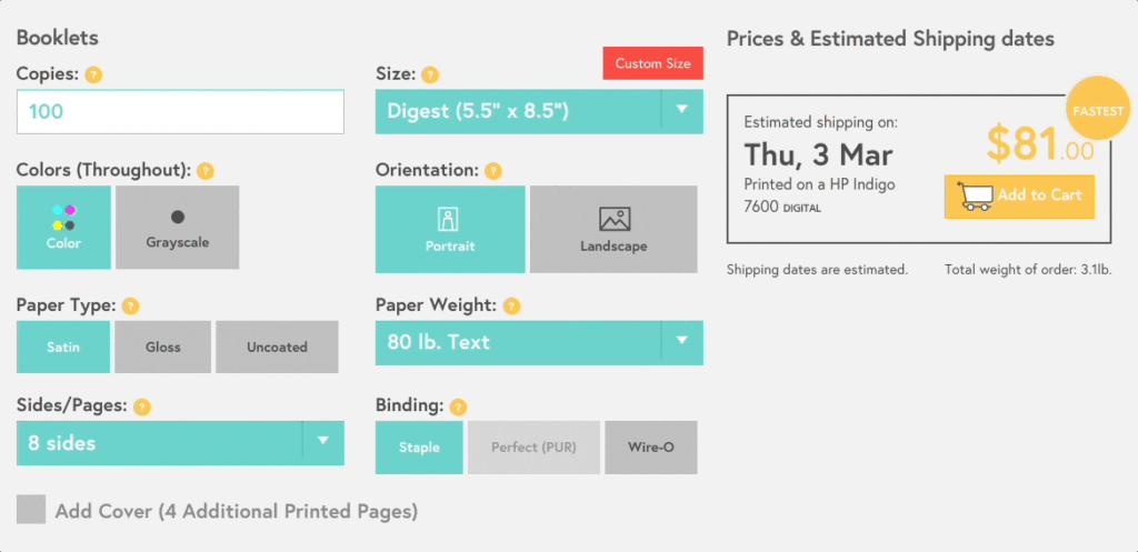
Mixam does it spectacularly. On its Booklets product page, this brand includes a price calculator feature. The calculator isn’t just a cool touch – it allows web visitors to choose the exact product features they require, and gives them a price and estimated shipping date.

Start Optimizing Product Pages with Great Design
Investing in the look of your product pages is an excellent strategy if you’re after impressive conversion rates.
As you look for ways to make the bottom of your sales funnel more effective, know that these six design strategies will help your marketing messages stick.
However, to get the most out of the tactics, you will, first, have to test them on your website.
So, before applying all six, make sure you have a good idea of what works for your business (and what doesn’t). That way, you’ll know you’re doing what’s right to get the absolute highest conversion rates – and crush your competition in the process.


